Friday, May 12, 2006
A Post Related to the Visual Display of Quantitative Information
by Tom BozzoIl Duce President Bush is expected to sign, the latest $70 billion in tax "cuts" (see also here at Angry Bear) for the moderately to very well-to-do.
In Mark Thoma's post, I couldn't help but notice the distorting nature of this table from the New York Times, based on data from the Tax Policy Center:

This reminded me of nothing but the Lyric Opera of Chicago subscriber survey, where readers with elephantine memories might recall I was shocked by the number (relative to most other surveys) of income categories above mine. The table's distortion is that the bottom four of the eleven categories account for 55 percent of "tax units" — i.e., would-be tax filers, whether they earn enough to file a return or not. Having a majority of the categories show at least a decent dinner-for-two's worth of tax shift benefits, though, helps contribute to the "money delusion" whereby low income families mistakenly think they are material beneficiaries of Bushist tax policies (*).
A clearer table would at least show how the percentages of taxpayers and percentages of the "cuts" coincide. Using the Tax Policy Center's data, here it is:

Alternatively, you could show equal population categories to get a better indication of the distribution of benefits. While the Tax Policy Center doesn't report exact percentiles, here's a close-enough-for rock-'n'-roll approximation:
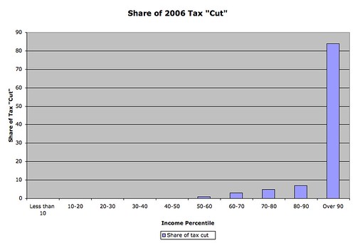
Given the presumably elite status of this blog's readership, if you're actually reading this, there's a decent chance that you actually are part of the elite that might benefit from the just-passed legislation. As for the general public, not so much.
---------------------------
(*) As co-CEO of a household that will "save" a grand or so from the 2006 AMT reprieve, I can only say this to low-income Bush voters: Thanks, suckers!
Congress has passed, and
In Mark Thoma's post, I couldn't help but notice the distorting nature of this table from the New York Times, based on data from the Tax Policy Center:
This reminded me of nothing but the Lyric Opera of Chicago subscriber survey, where readers with elephantine memories might recall I was shocked by the number (relative to most other surveys) of income categories above mine. The table's distortion is that the bottom four of the eleven categories account for 55 percent of "tax units" — i.e., would-be tax filers, whether they earn enough to file a return or not. Having a majority of the categories show at least a decent dinner-for-two's worth of tax shift benefits, though, helps contribute to the "money delusion" whereby low income families mistakenly think they are material beneficiaries of Bushist tax policies (*).
A clearer table would at least show how the percentages of taxpayers and percentages of the "cuts" coincide. Using the Tax Policy Center's data, here it is:
Alternatively, you could show equal population categories to get a better indication of the distribution of benefits. While the Tax Policy Center doesn't report exact percentiles, here's a close-enough-for rock-'n'-roll approximation:
Given the presumably elite status of this blog's readership, if you're actually reading this, there's a decent chance that you actually are part of the elite that might benefit from the just-passed legislation. As for the general public, not so much.
---------------------------
(*) As co-CEO of a household that will "save" a grand or so from the 2006 AMT reprieve, I can only say this to low-income Bush voters: Thanks, suckers!
Comments:
<< Home

Mark: You're welcome. David Cay Johnston's lede was in the right place. The TPC's need (thanks to income skewness) to break out a lot of high-income categories to better resolve the distribution of the effects can convey the impression that "middle" incomes -- and I'm amazed at how many presumptive non-economists Google income and wealth distribution information -- are considerably higher than they really are.
Post a Comment
<< Home
![]()
